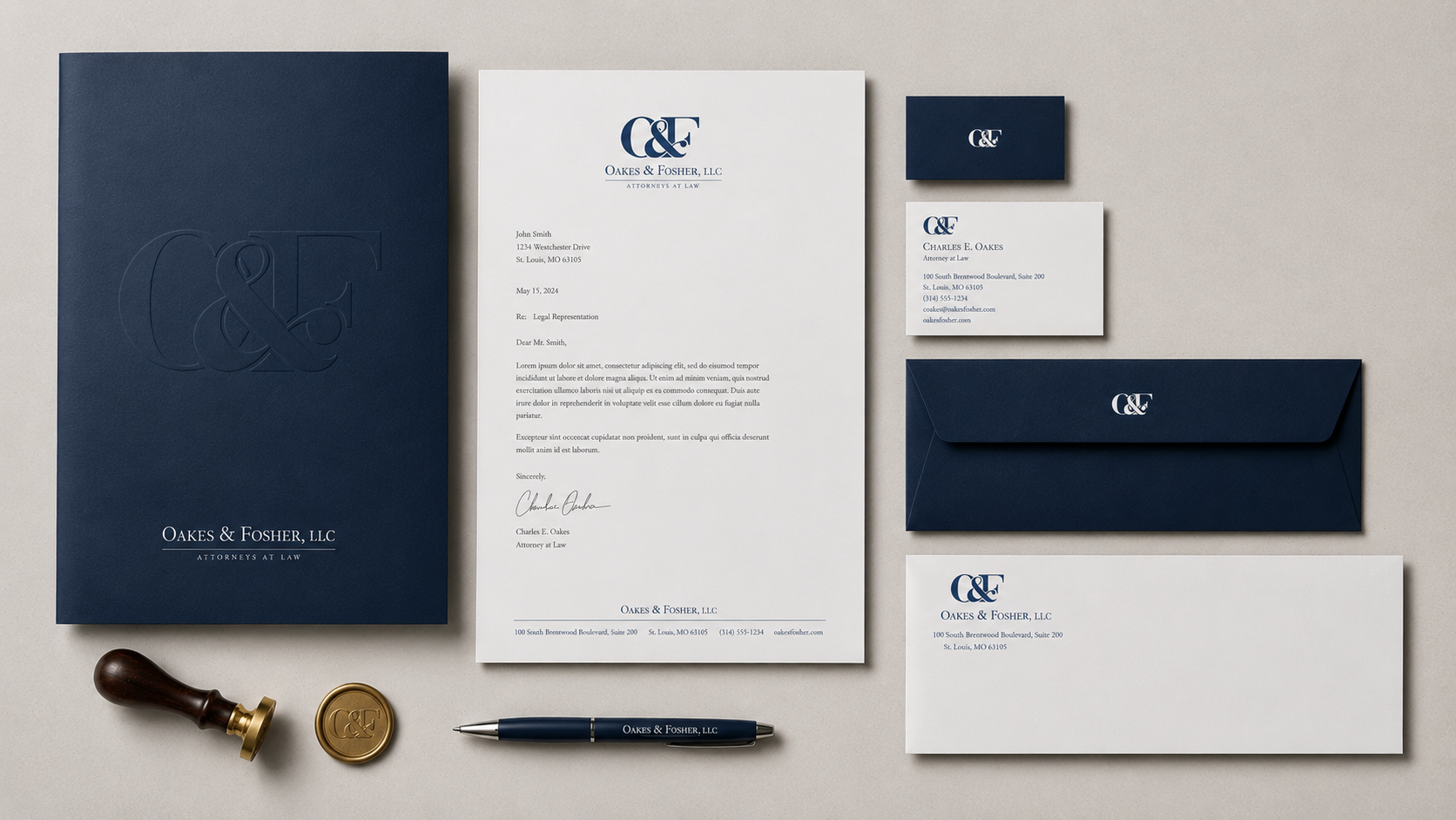

Oakes & Fosher | Legal Services
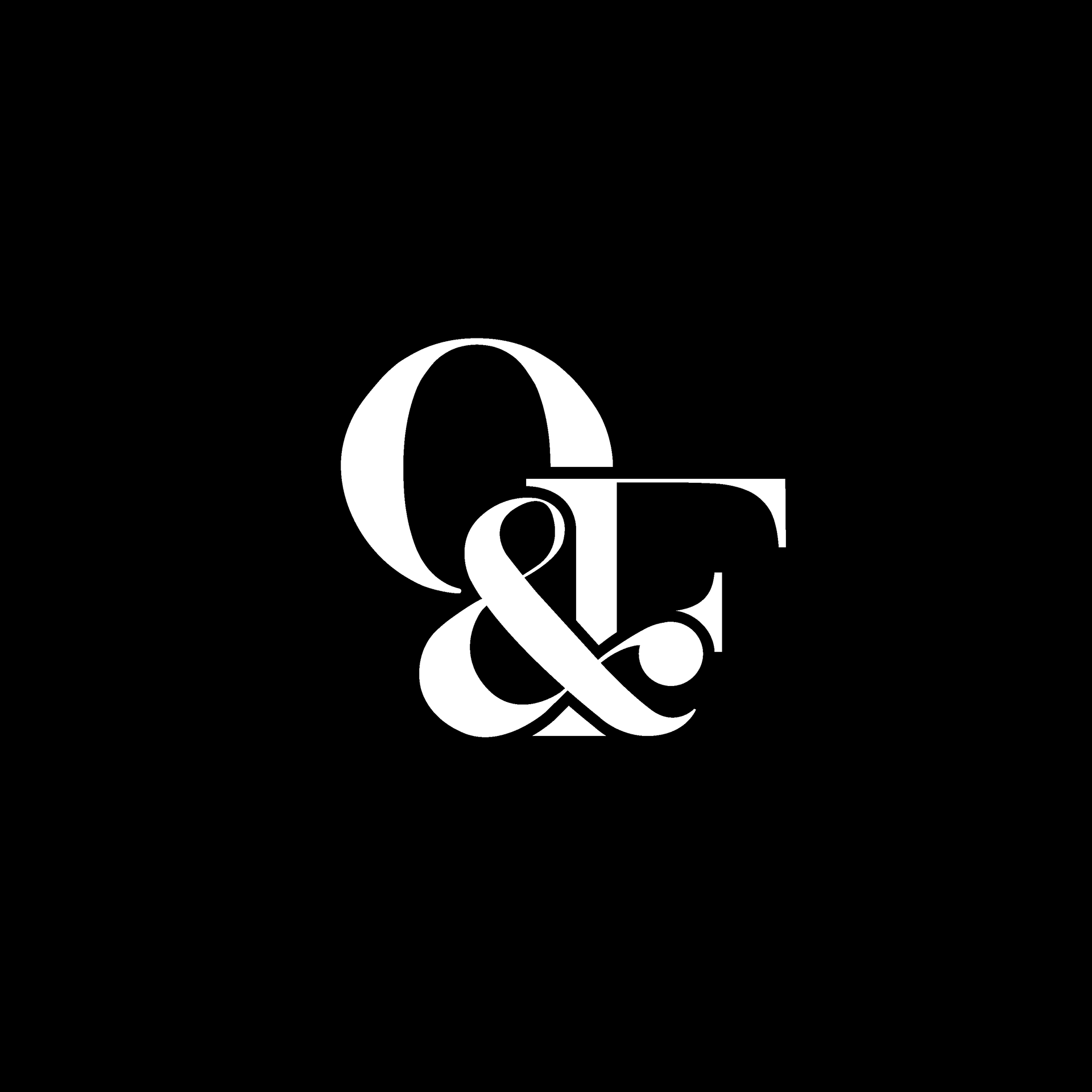
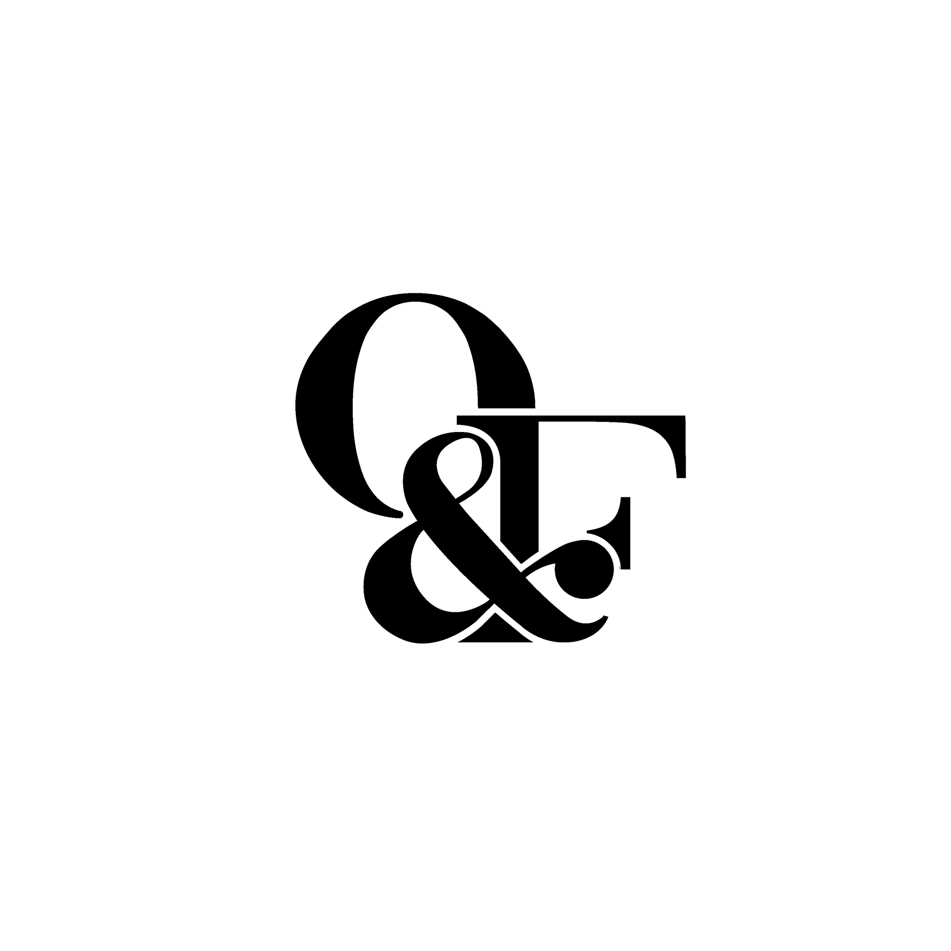
Oakes & Fosher needed a visual identity that conveyed trust and professionalism without relying on traditional legal clichés. The custom O&F monogram places the ampersand at the center, symbolizing the firm's partnership, while classic serif typography reinforces authority and longevity.
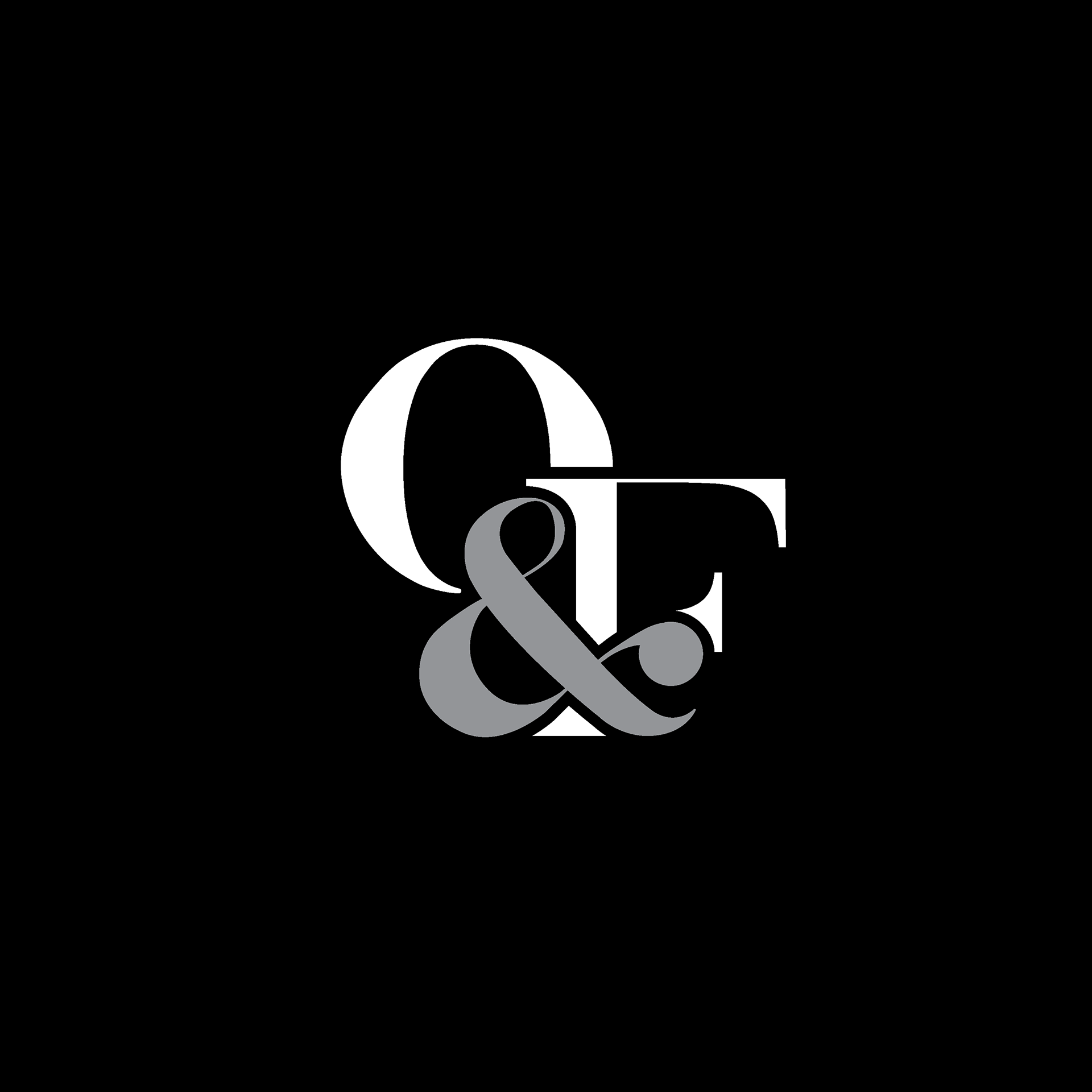
In addition to the primary identity, black-and-white and grayscale versions were developed to create a more contemporary, elevated feel.