DNA | Apparel Brand
DNA, short for Dictate. Never Accept., is one of St. Louis’ go-to spots for rare kicks and exclusive streetwear drops. The store already had the credibility and reputation, I just thought the branding was underselling them.
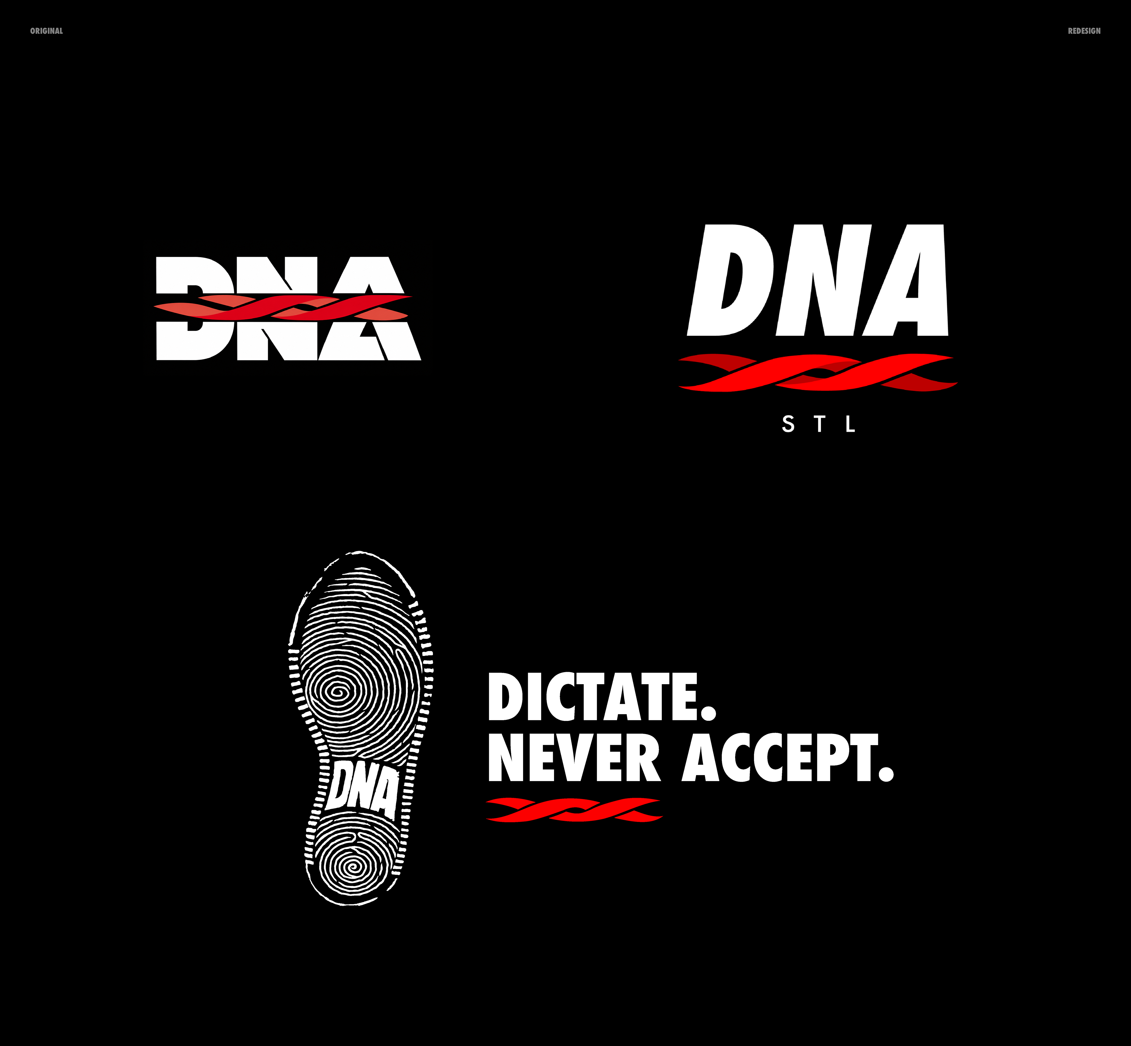
I put together an unsolicited rebrand that kept the recognizable pieces of the original, but gave the whole identity a cleaner, elevated streetwear feel.
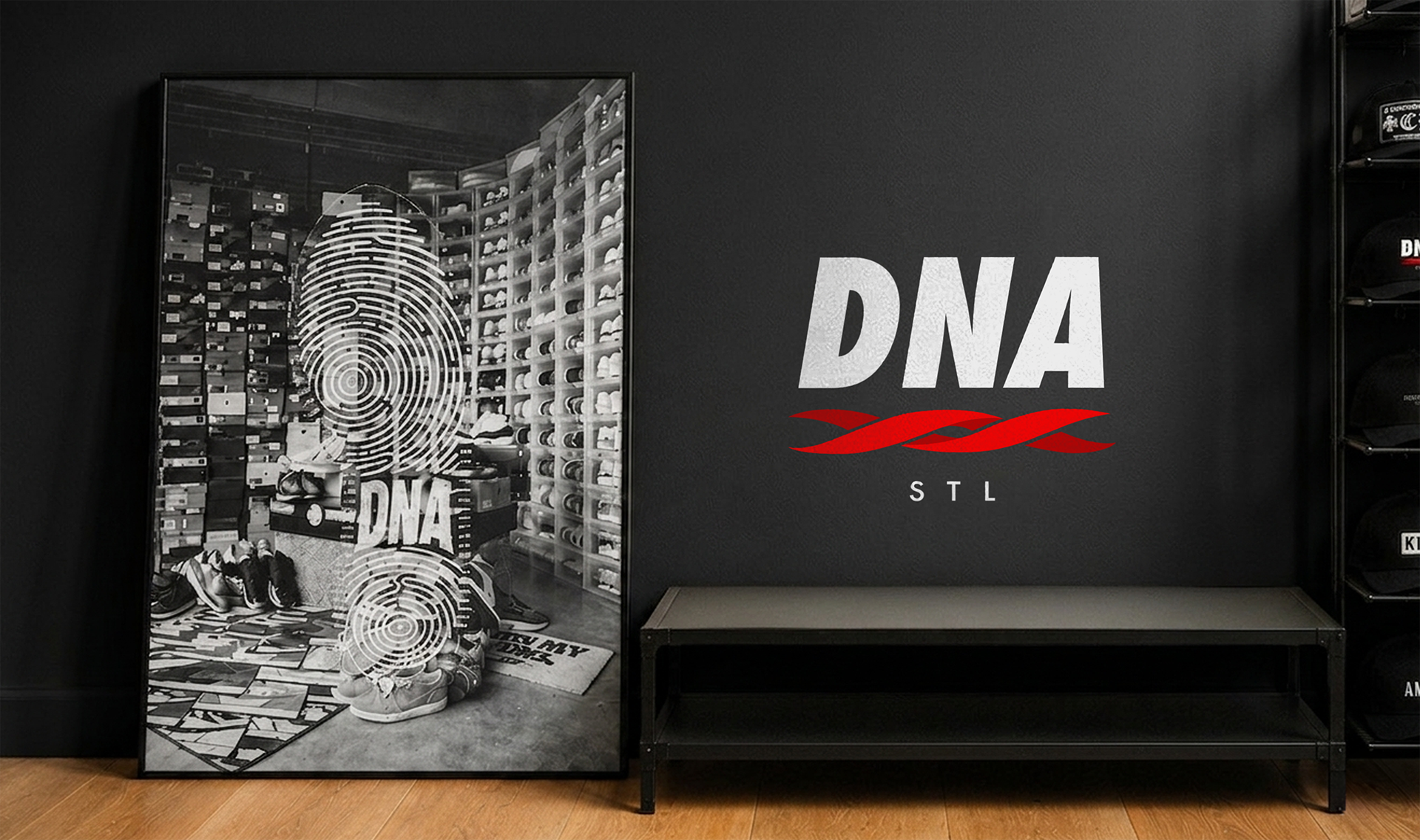
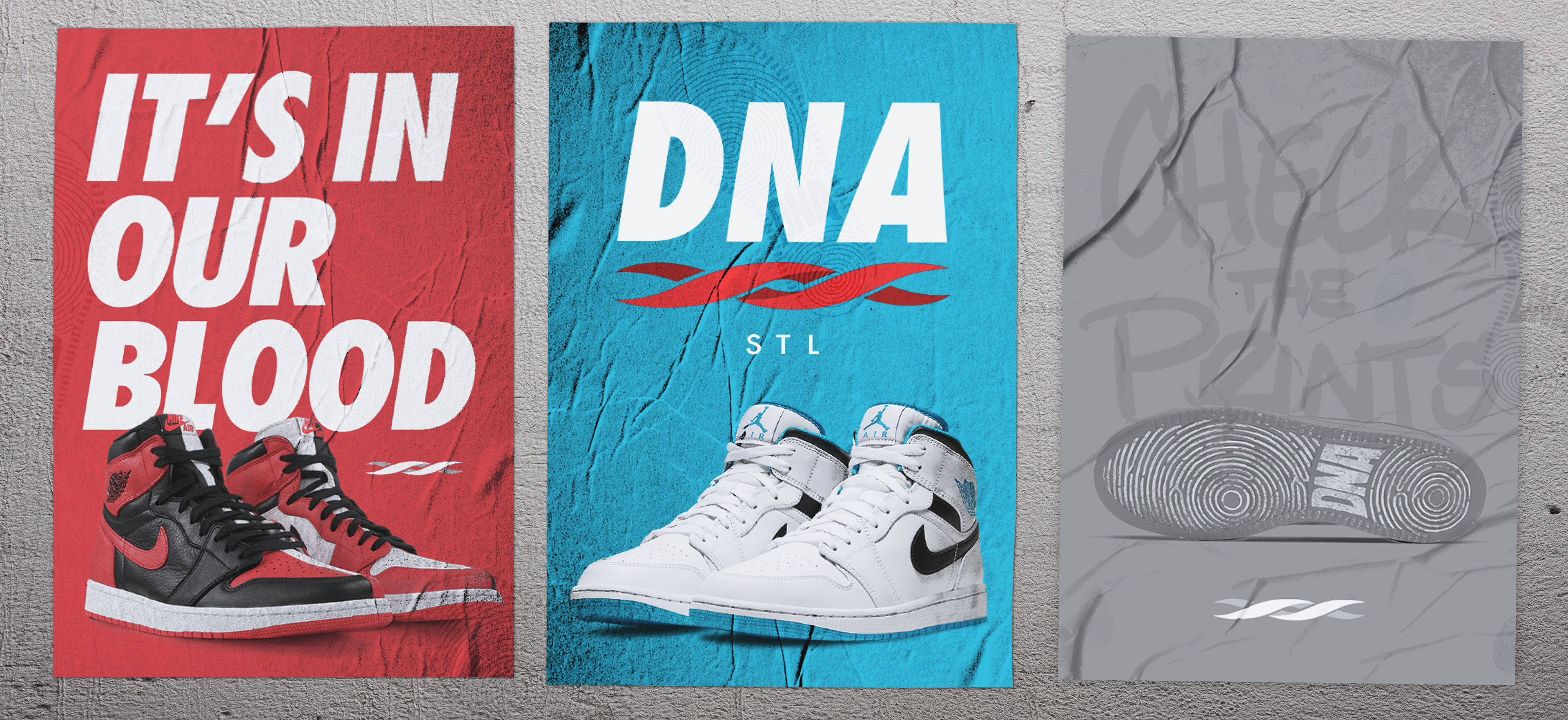
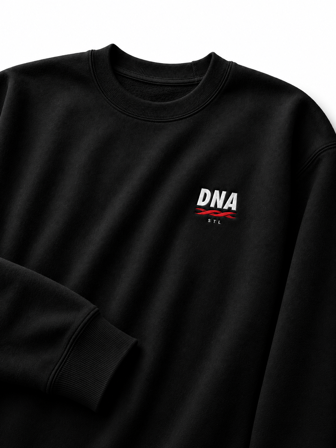
For the primary logo, I cleaned up and separated the original elements. DNA sits big above a simplified red DNA strand, with a small STL underneath. I used Futura, the same font used by Supreme and Nike (a hypebeast staple), so the typography already felt familiar.
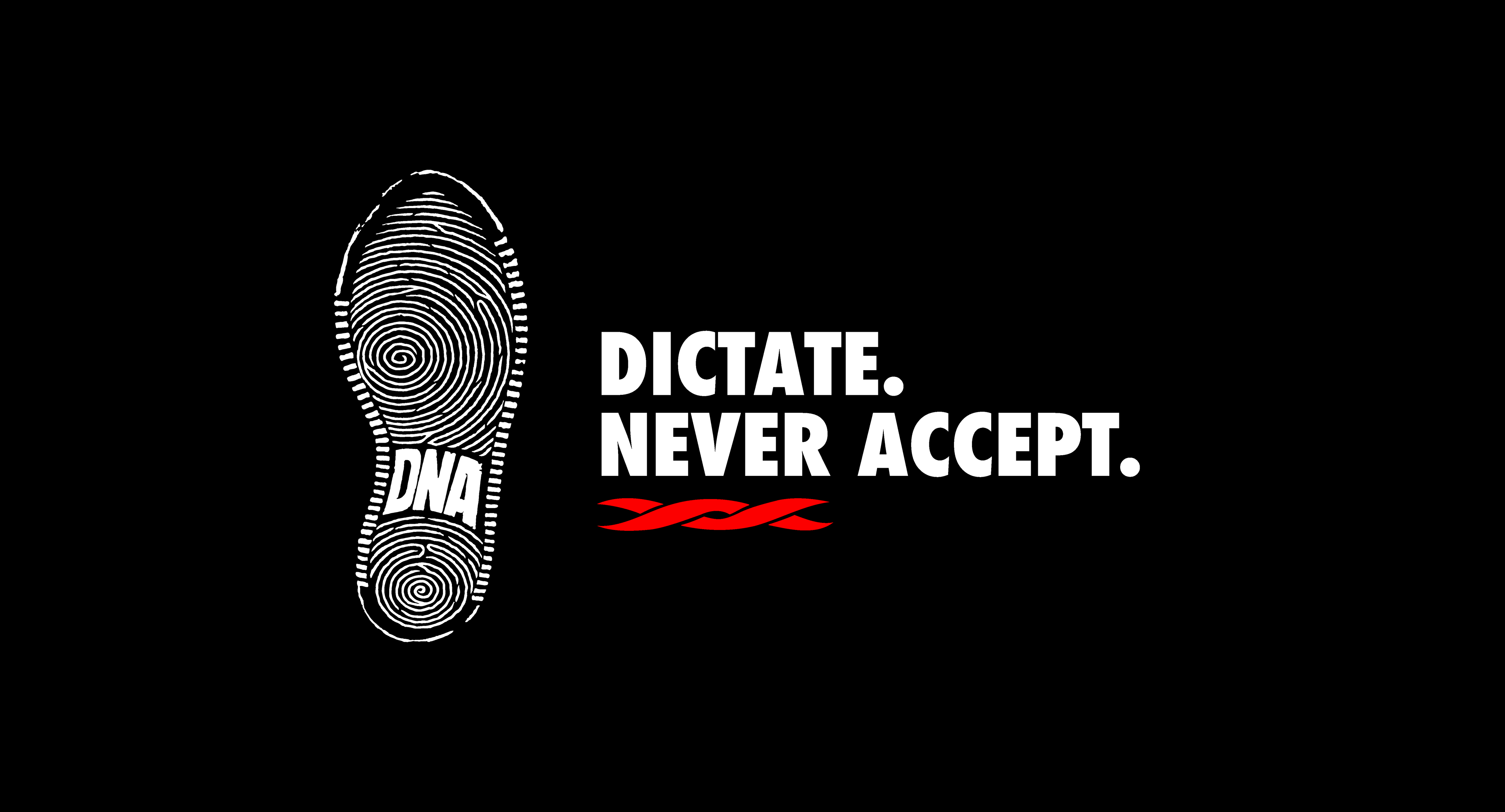
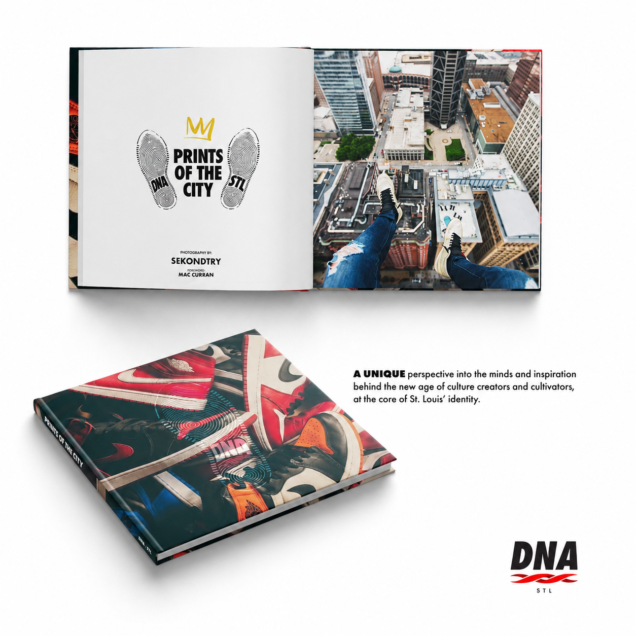
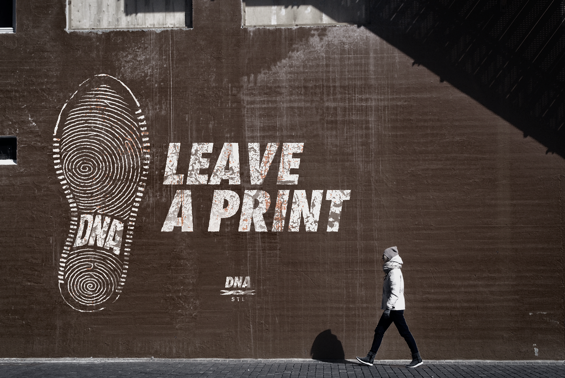
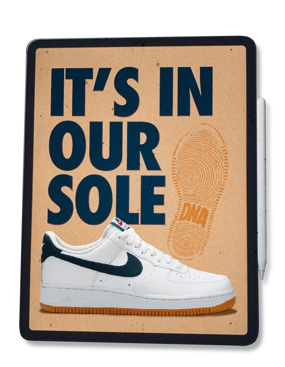
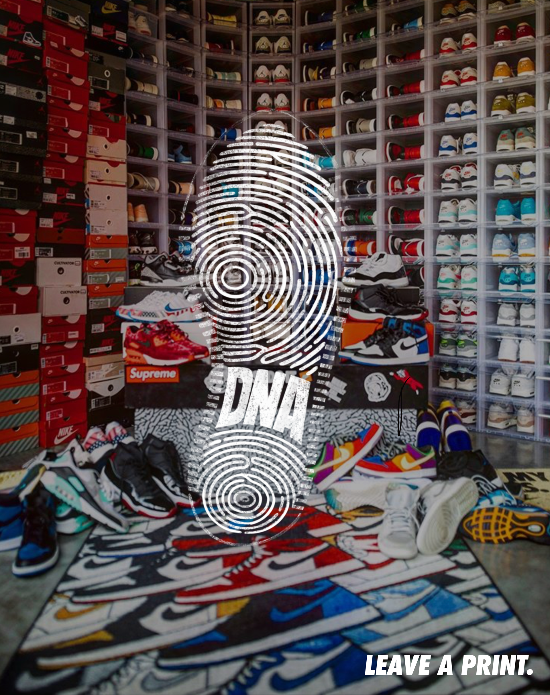
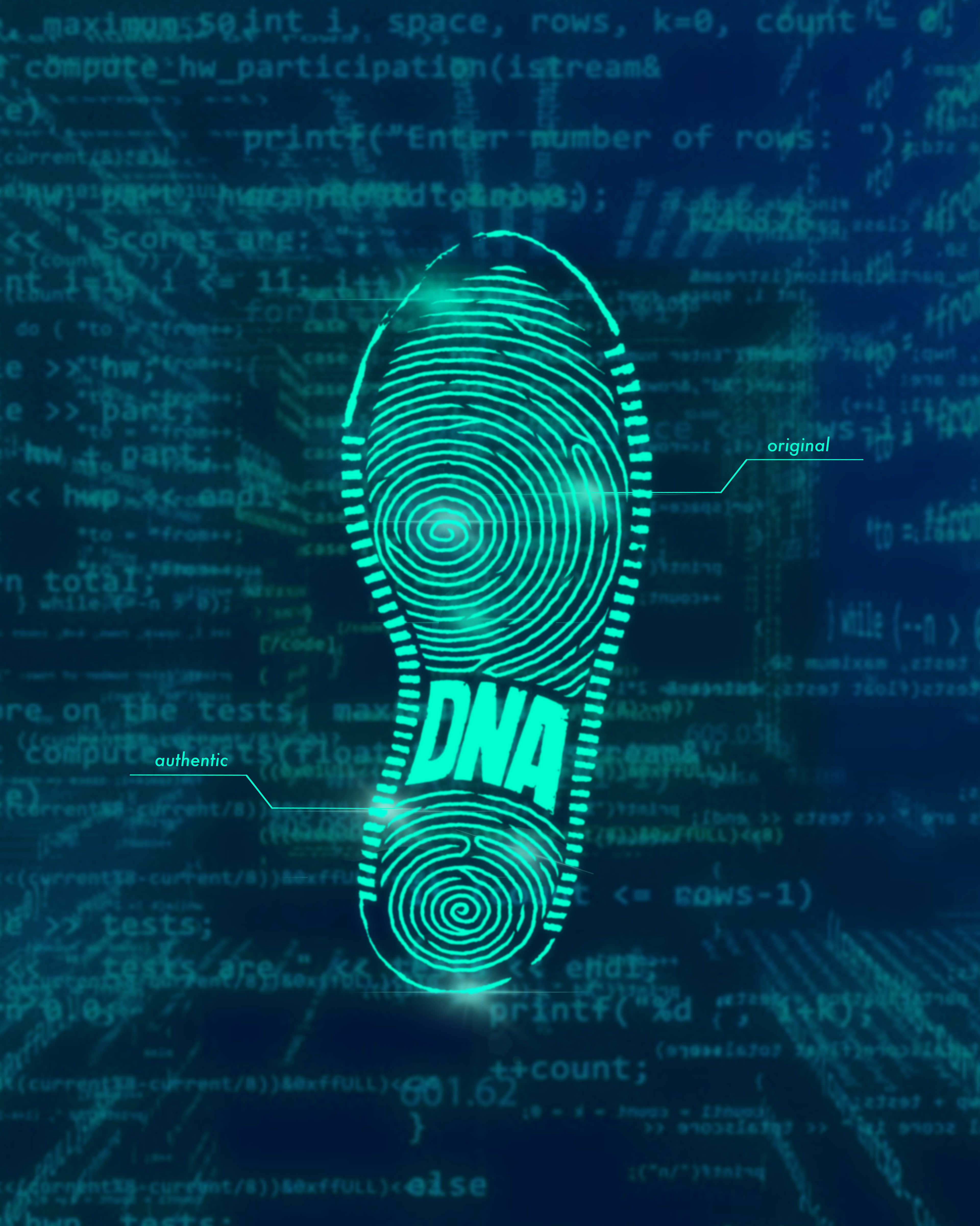
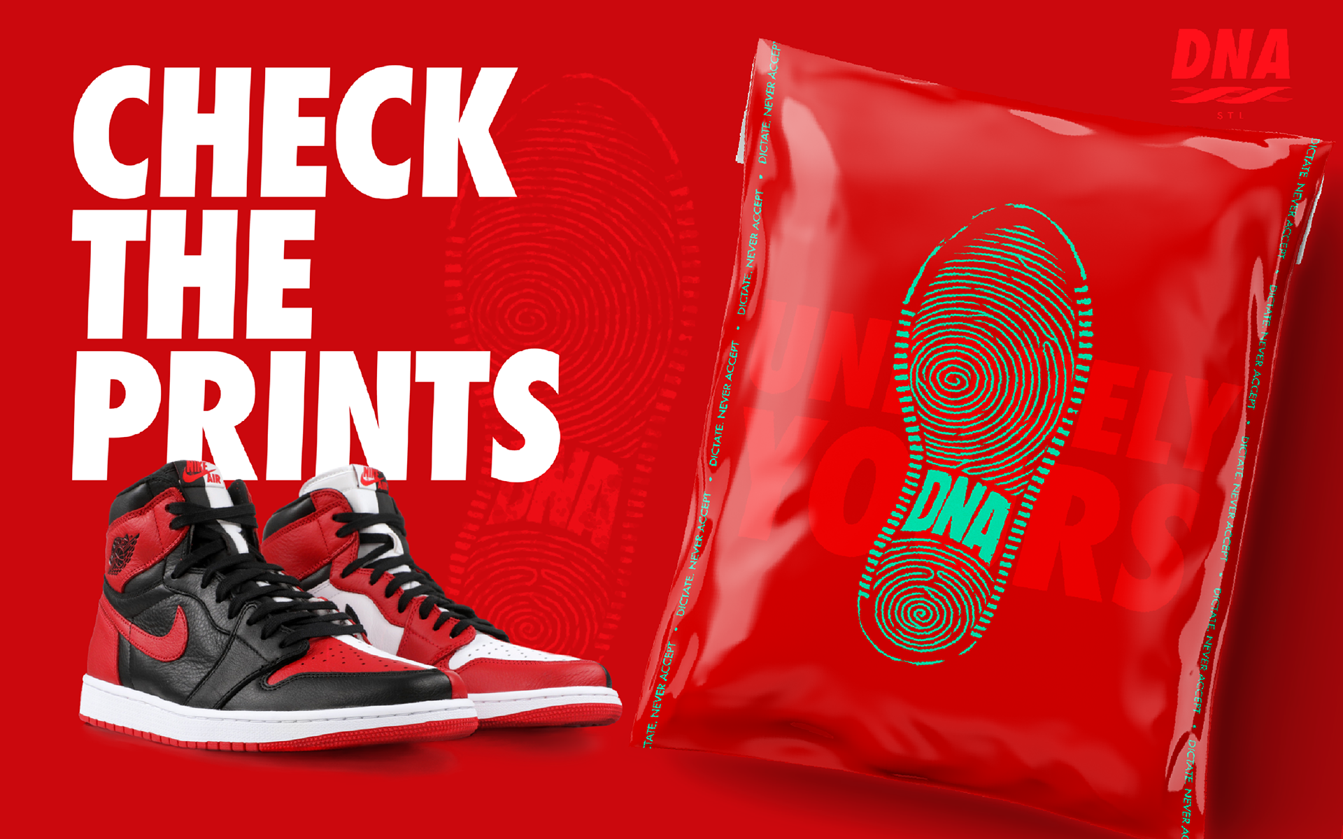
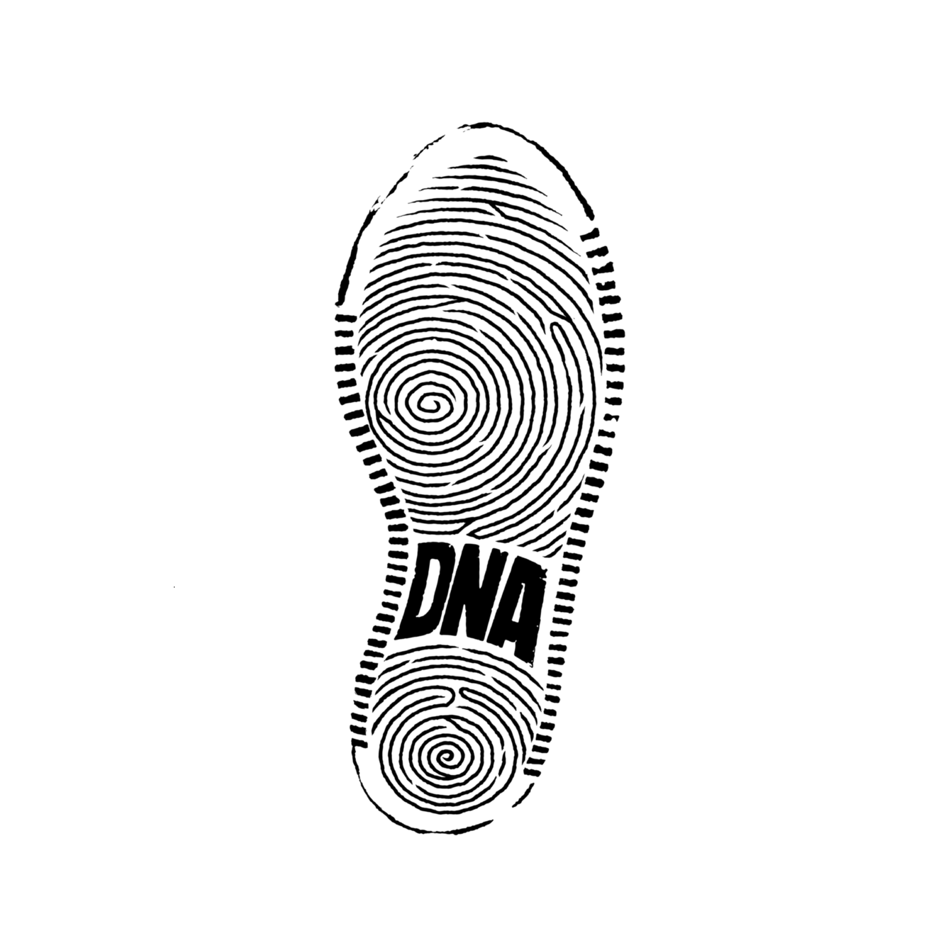
The secondary mark came to me one day when I was looking at the bottom of my Nike Court Vision sneakers and realized the tread pattern looked almost like a fingerprint. That became the basis for the mark, combining the outsole with the idea of individuality and identity, which felt pretty perfect for a brand called DNA. It would show up more sparingly than the primary logo, but it became an important part of the overall identity. It also opened up campaign ideas like “LEAVE A PRINT” for OOH and “UNIQUELY YOURS” for packaging.
DNA ended up loving the concept enough to offer me an internship because of it. Which is a reminder: Show the work you want to get hired to do.
Dictate. Never Accept.