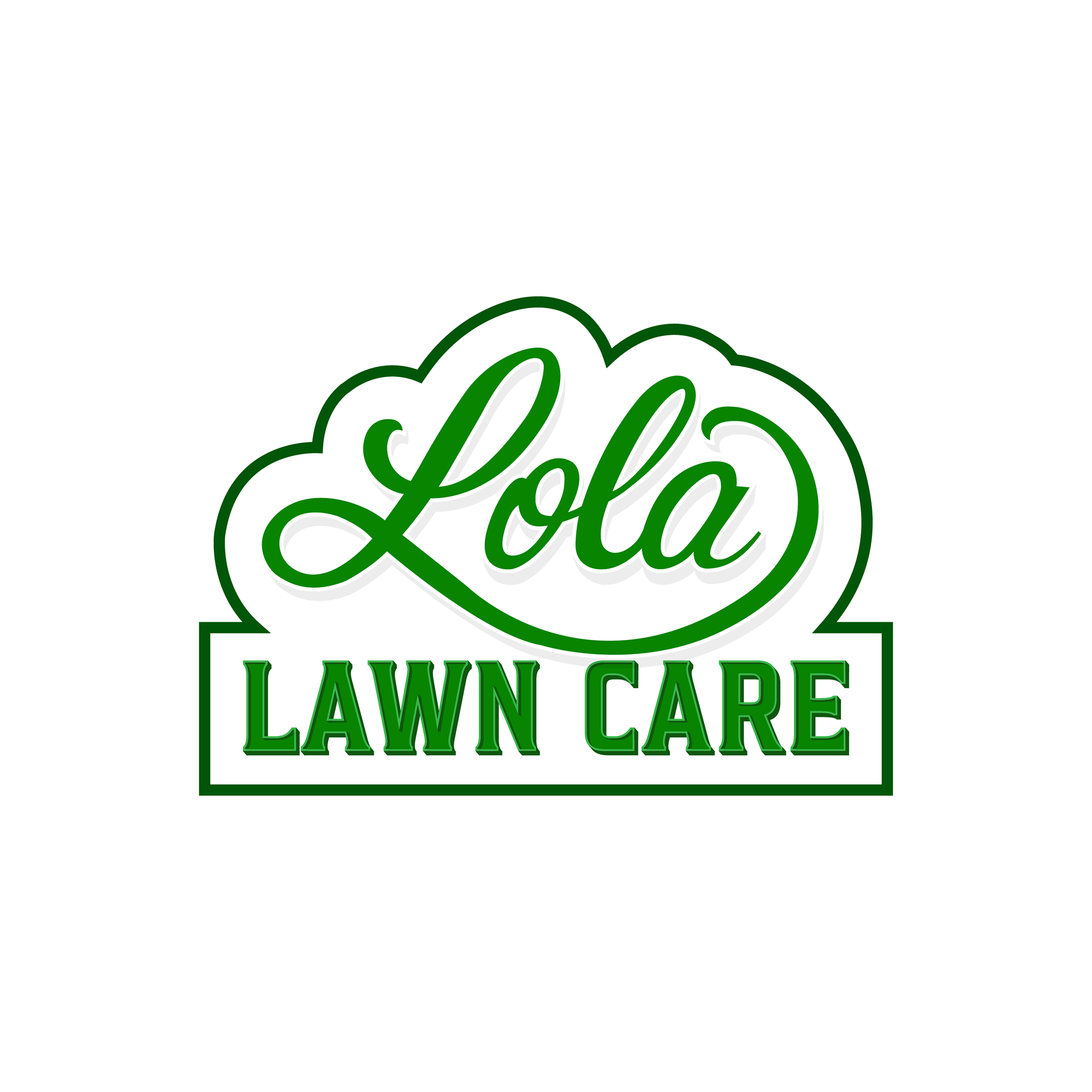

Lola Lawn Care | Residential Services
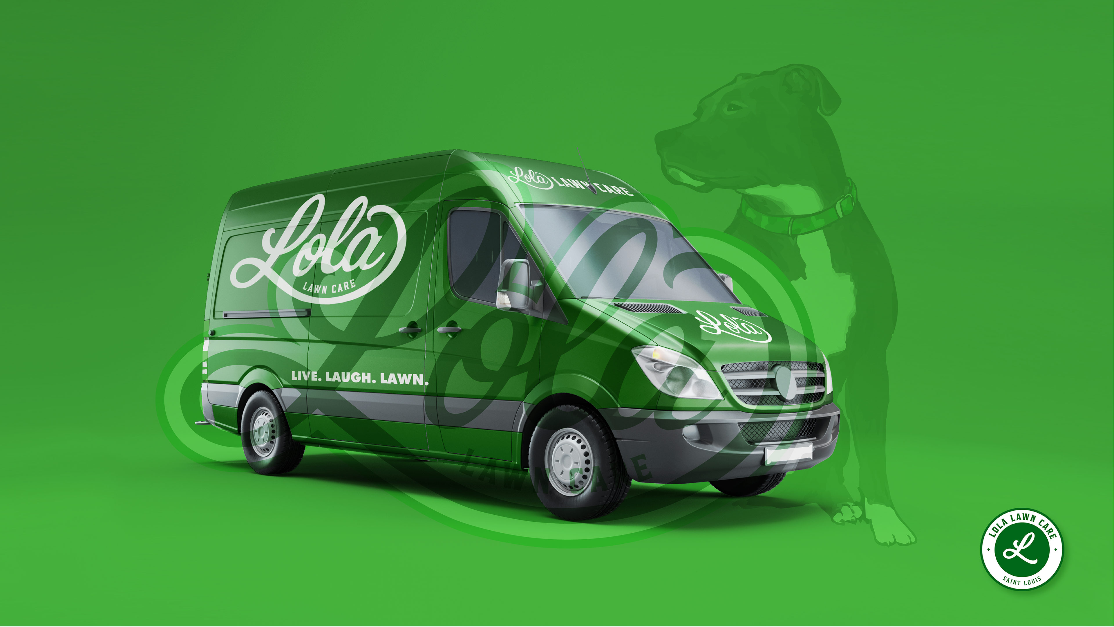
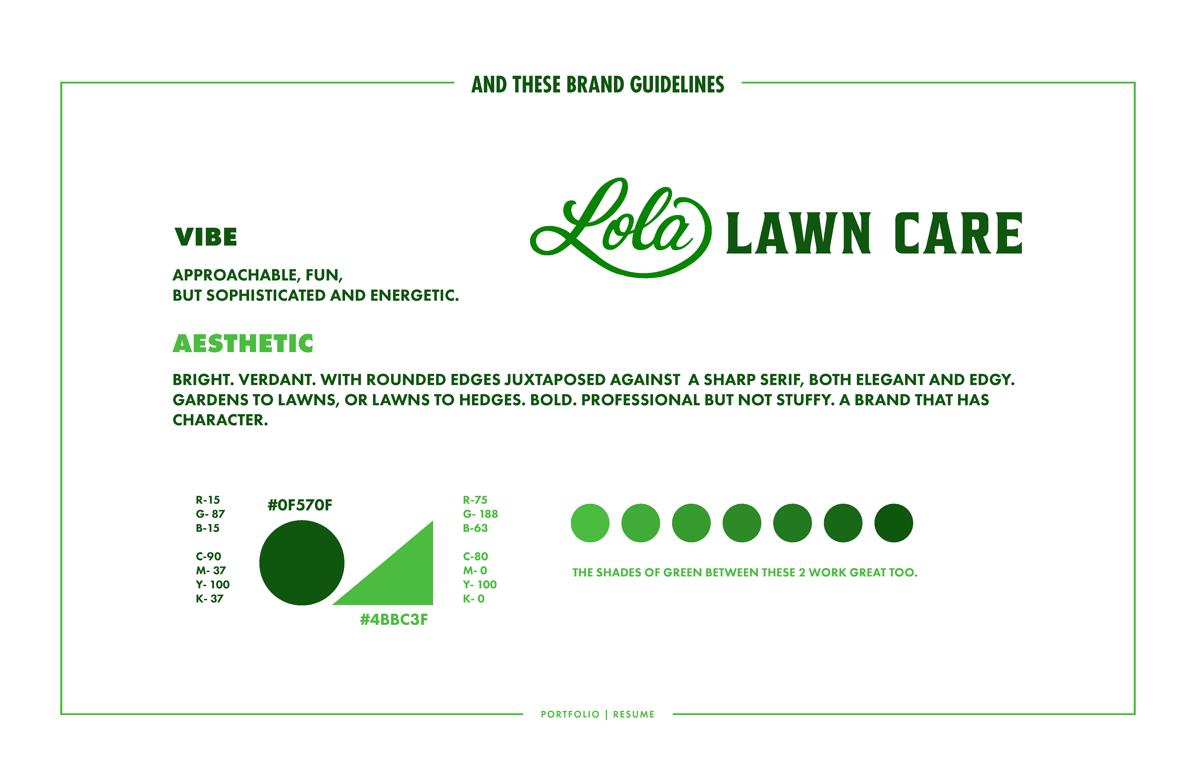
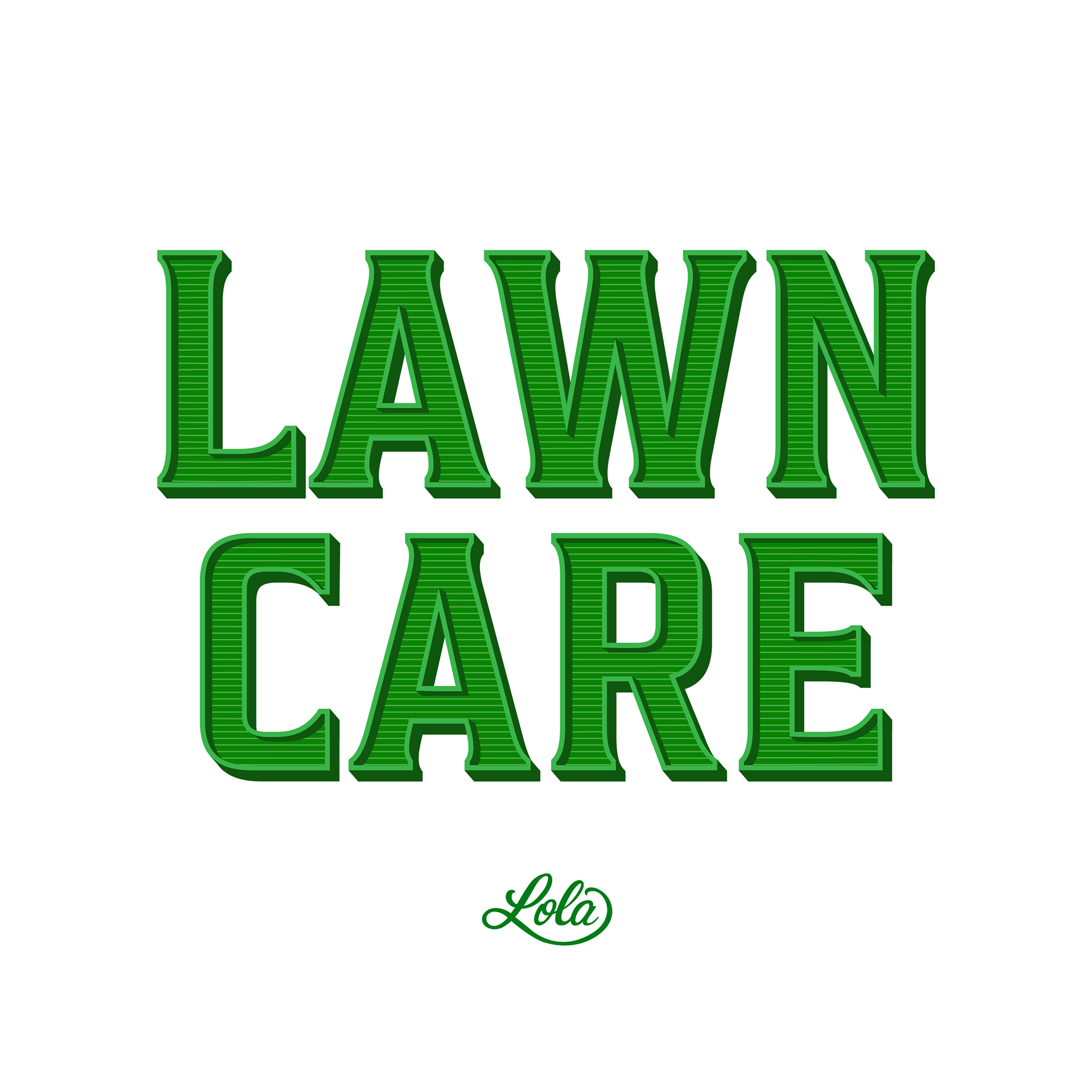
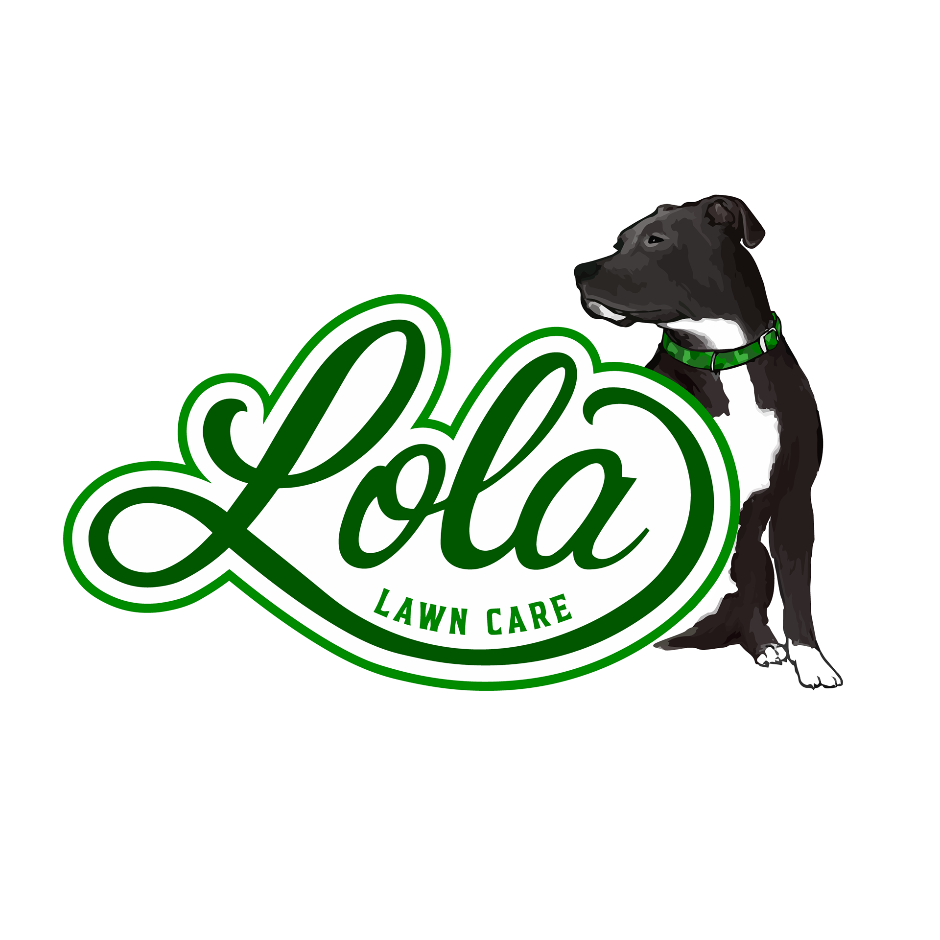
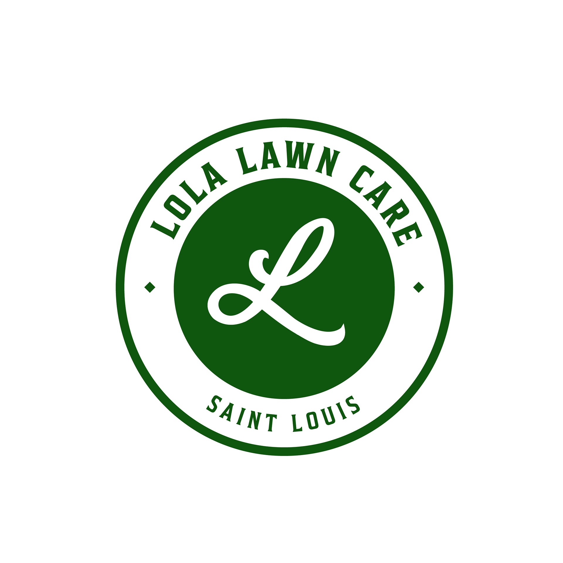
The owner of a new Lawn Care Company came to me in need of a logo and branding to help launch his business, Lola Lawn Care, named after his beloved dog. The demo he was targeting was young, affluent homeowners in St. Louis. After some initial sketches, we both agreed on this flowing cursive workmark. The juxtaposition between the sweeping tail of the L, and the sharp angles in lawn care, is jarring but pleasant. Both modern and elegant.
A clean cut and fresh take on a literal dirty business.
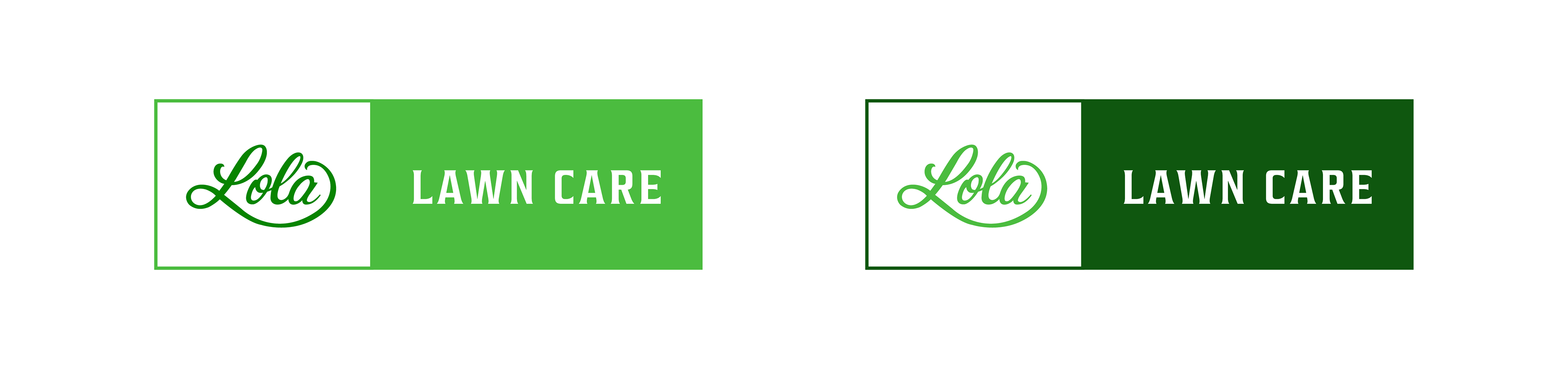
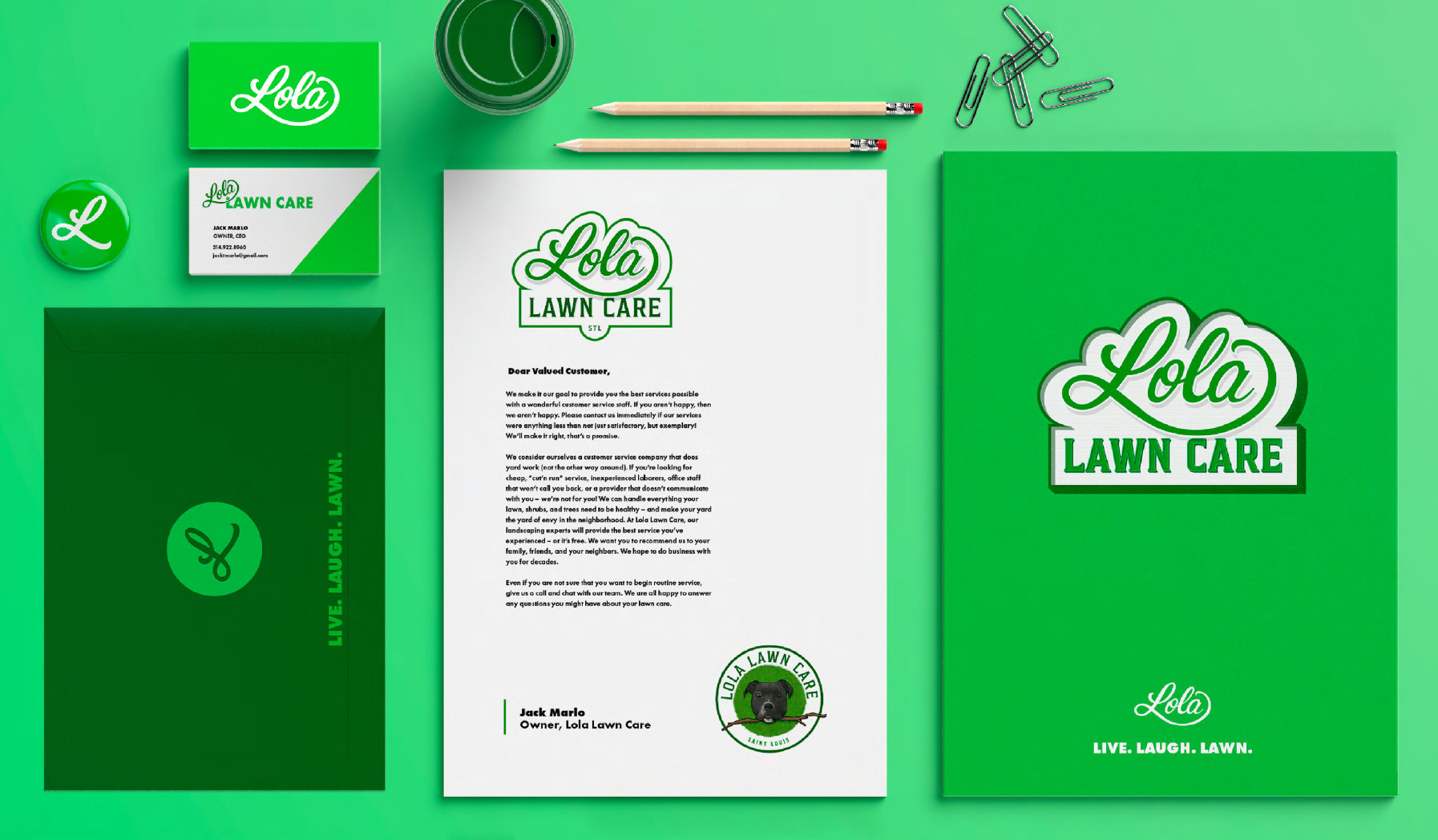
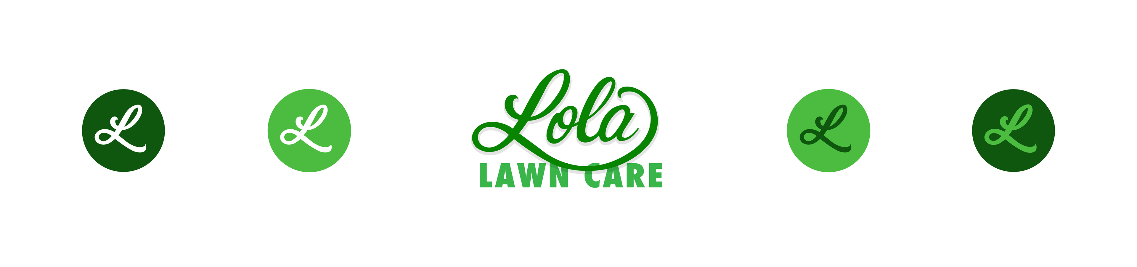
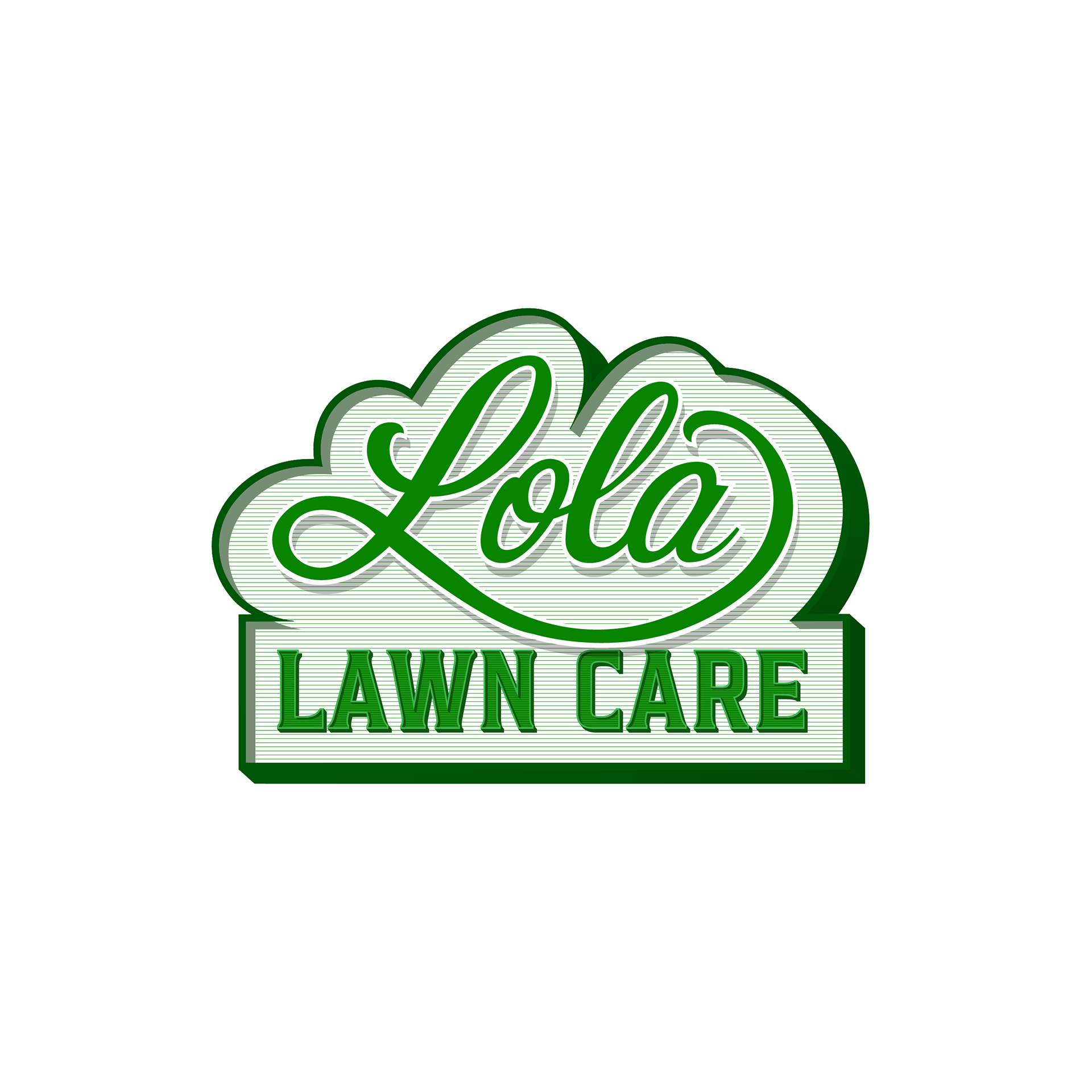
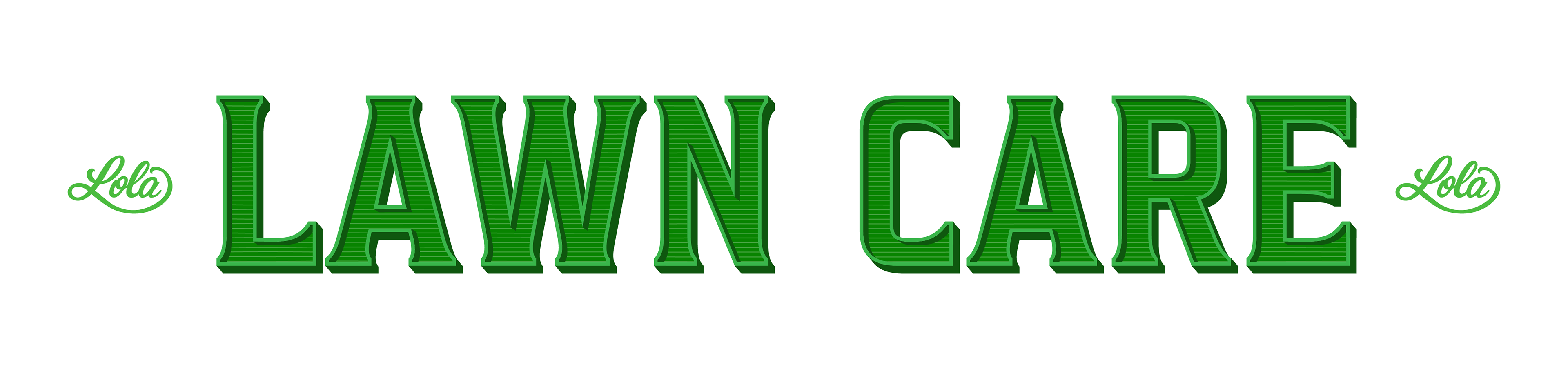
Rather than creating a single logo, the project focused on building a flexible brand system. The core mark was designed to expand into a family of dynamic logo variations, allowing the identity to adapt across vehicles, uniforms, yard signs, social media, merchandise, and digital applications while maintaining a consistent visual language.
The difference is in the details.