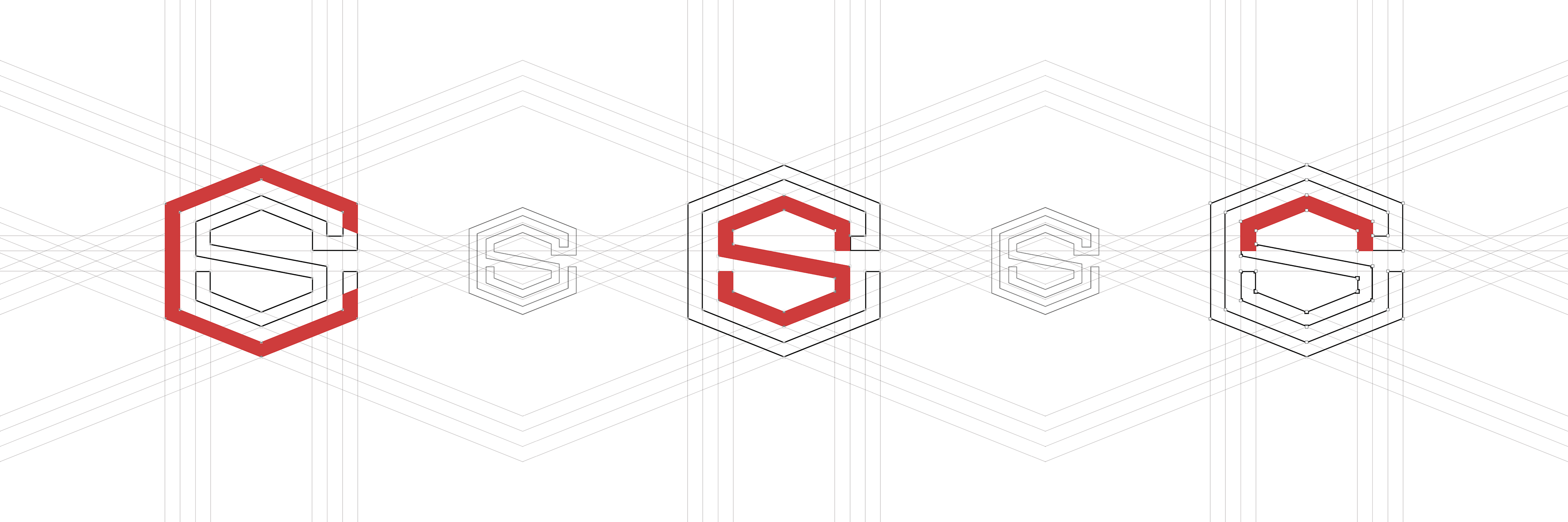
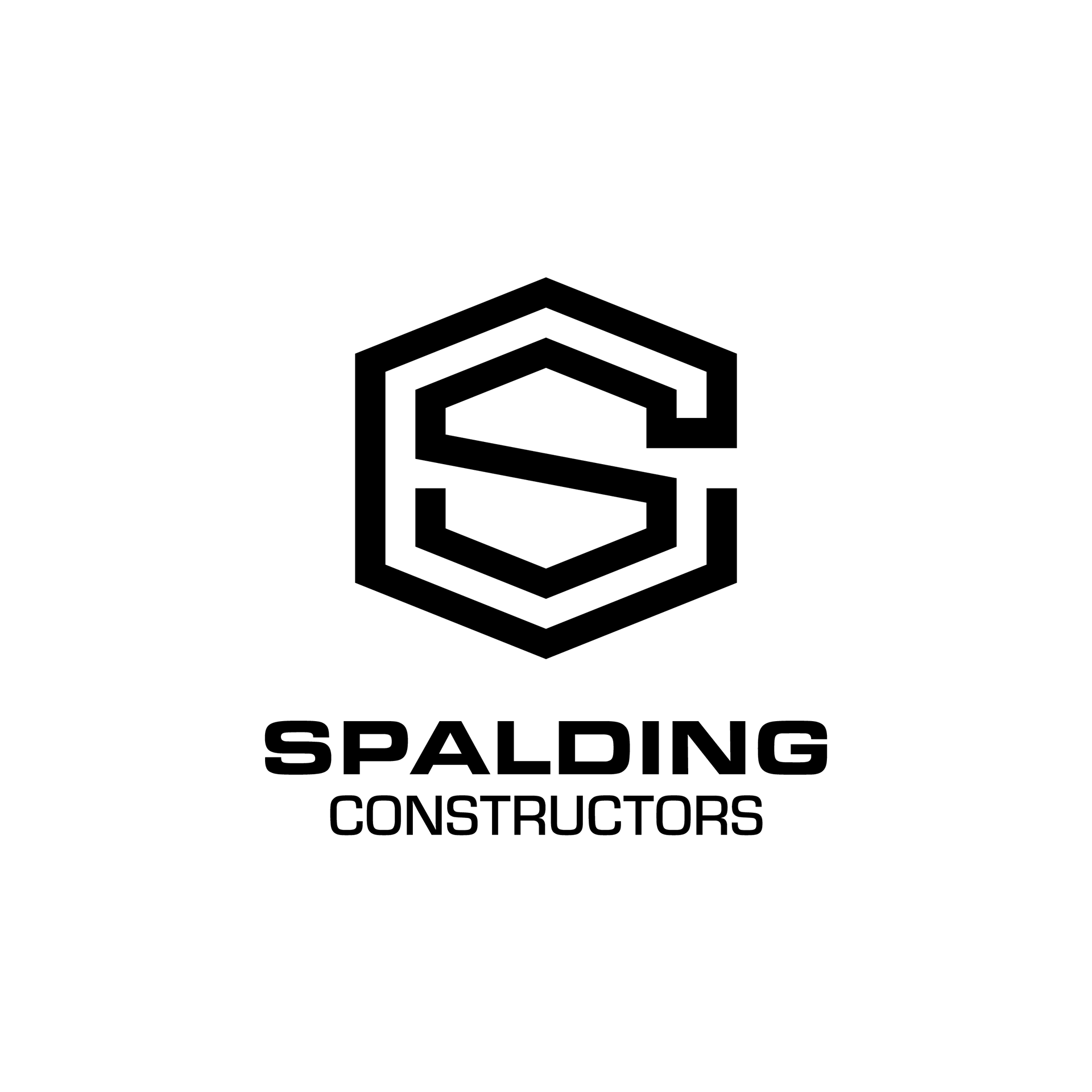
Spalding Constructors | Construction
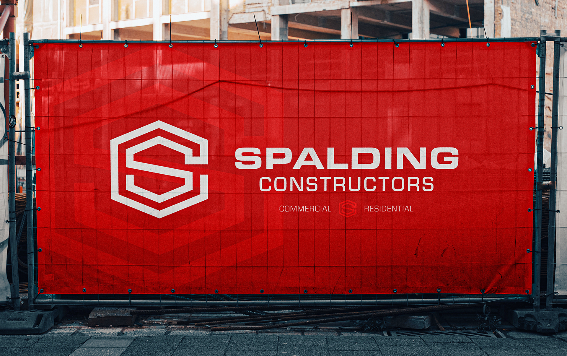
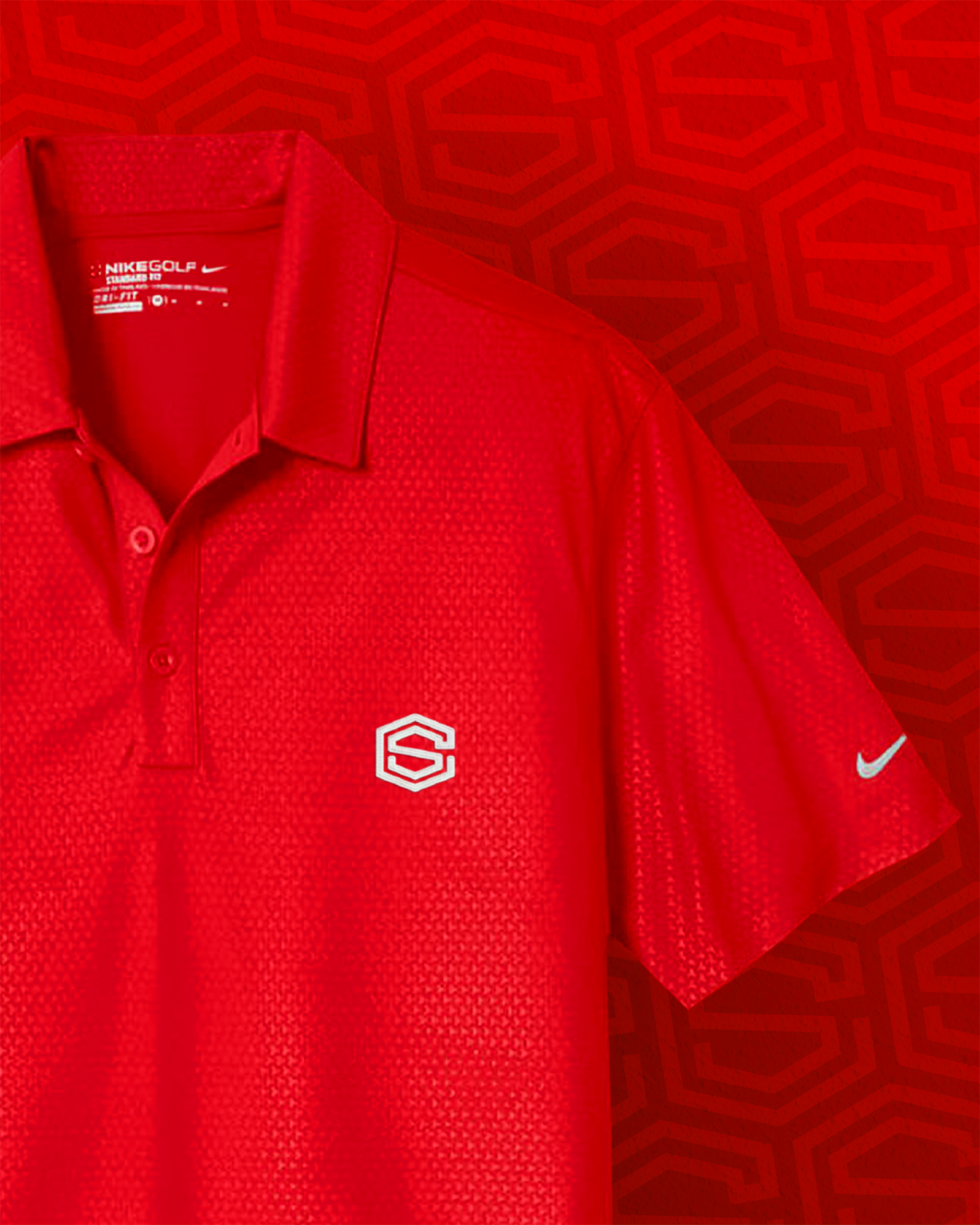
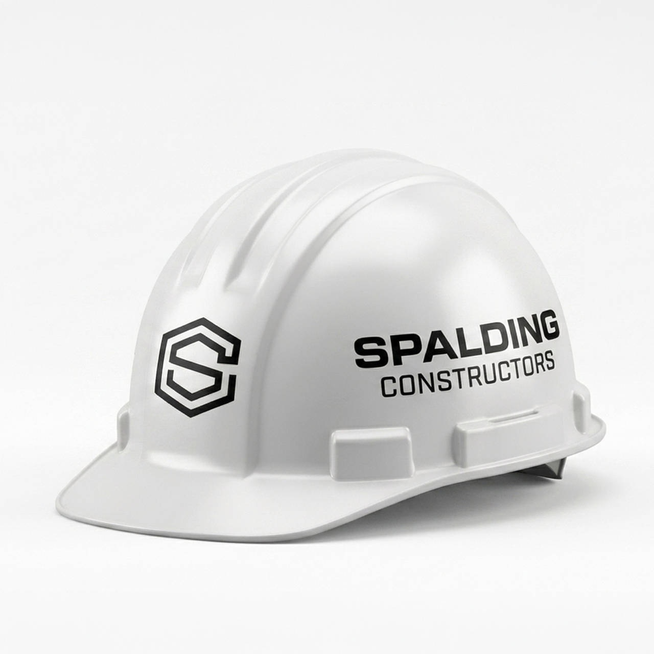
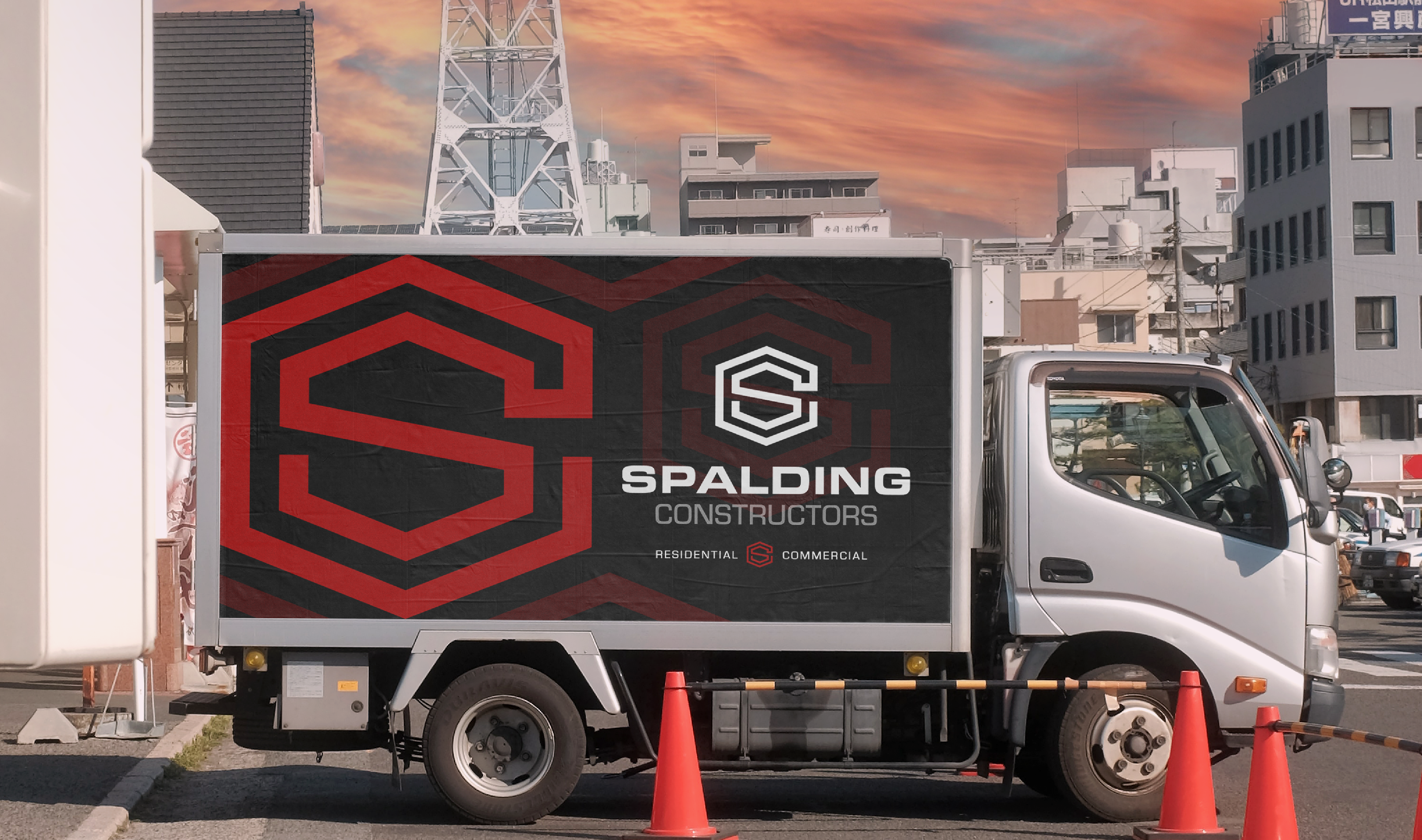
Spalding Constructors came to me for a logo as they established their brand across mid-Missouri. The result was a complete identity system built around a bold geometric badge-like logo.
The logo merges an “S” nestled within a “C” while subtly forming the silhouette of a roofline. Combined with the strength of the badge shape, the mark communicates trust, stability, and craftsmanship through a deliberate use of form and geometry. The logo distills the company's identity into a simple, memorable mark.
In reality, I also just thought it looked cool.