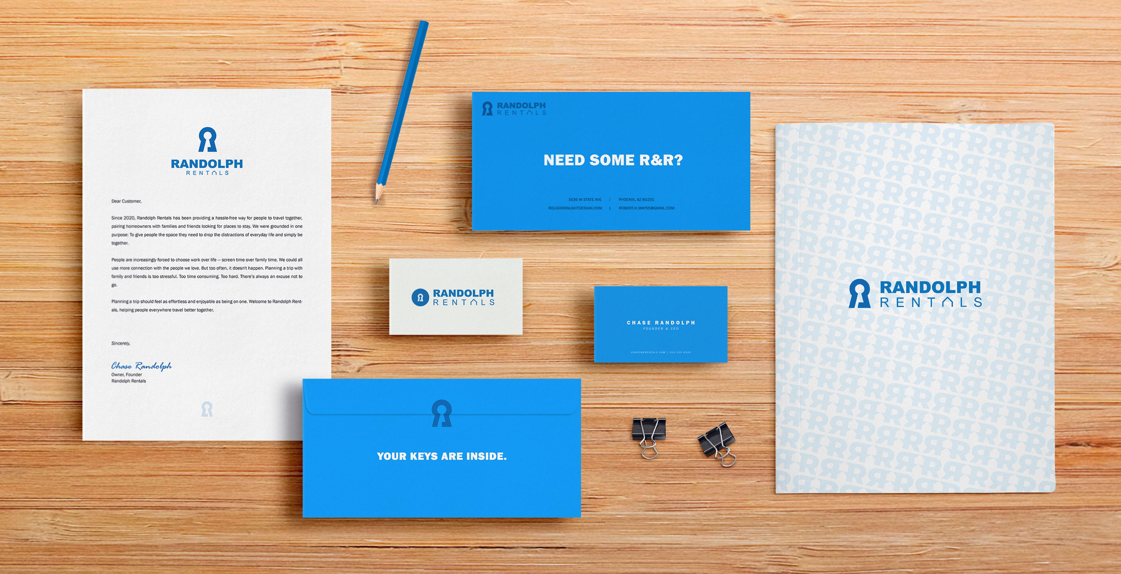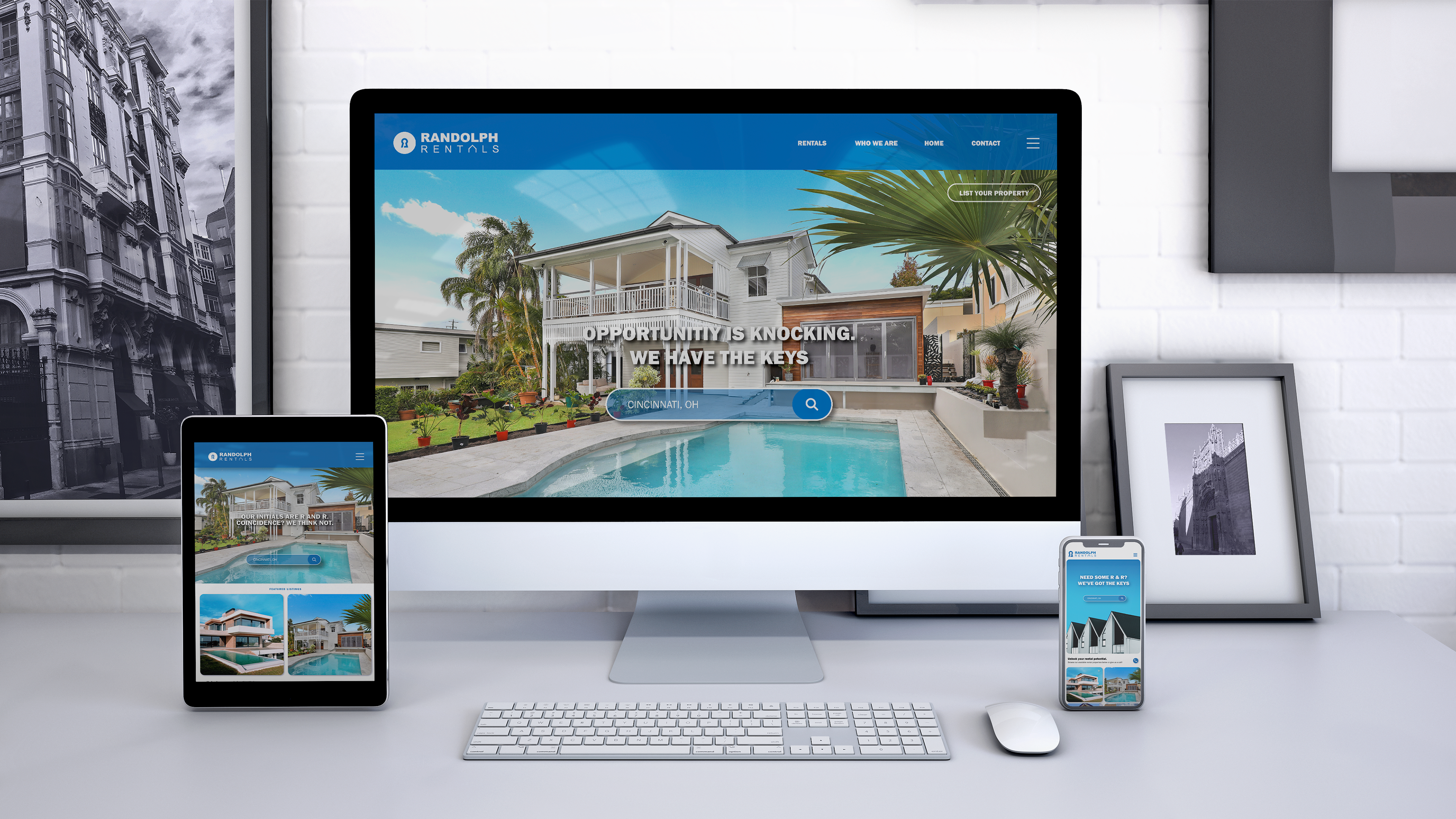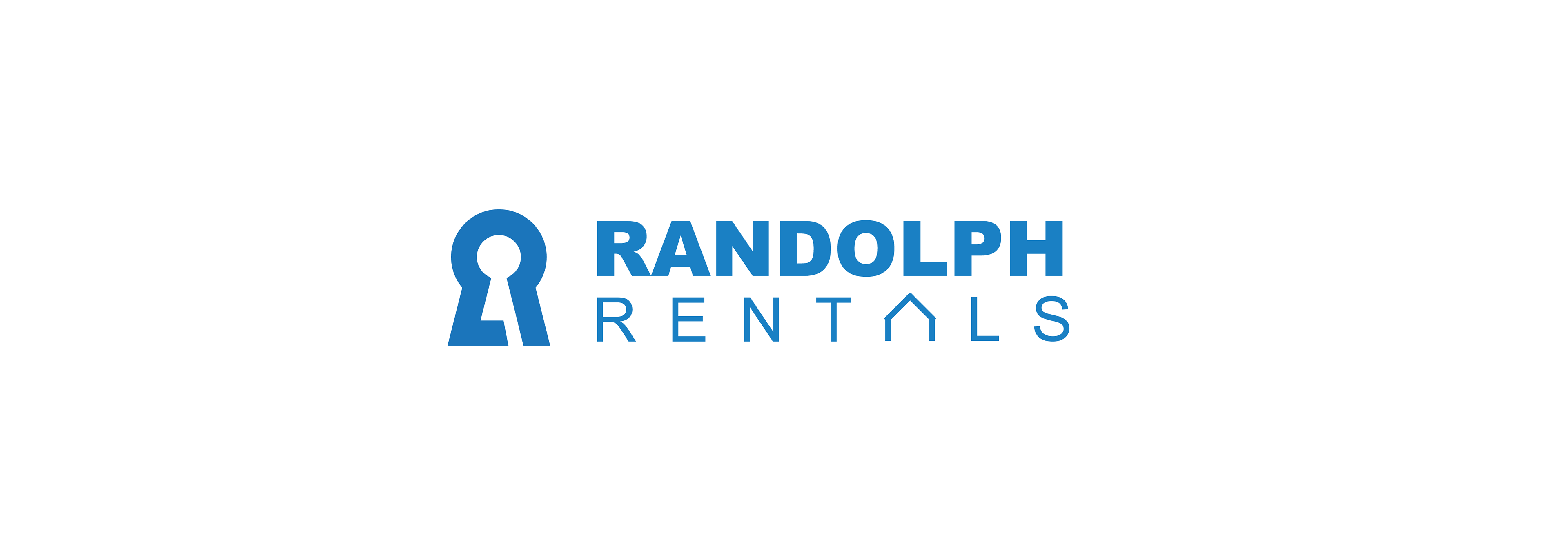
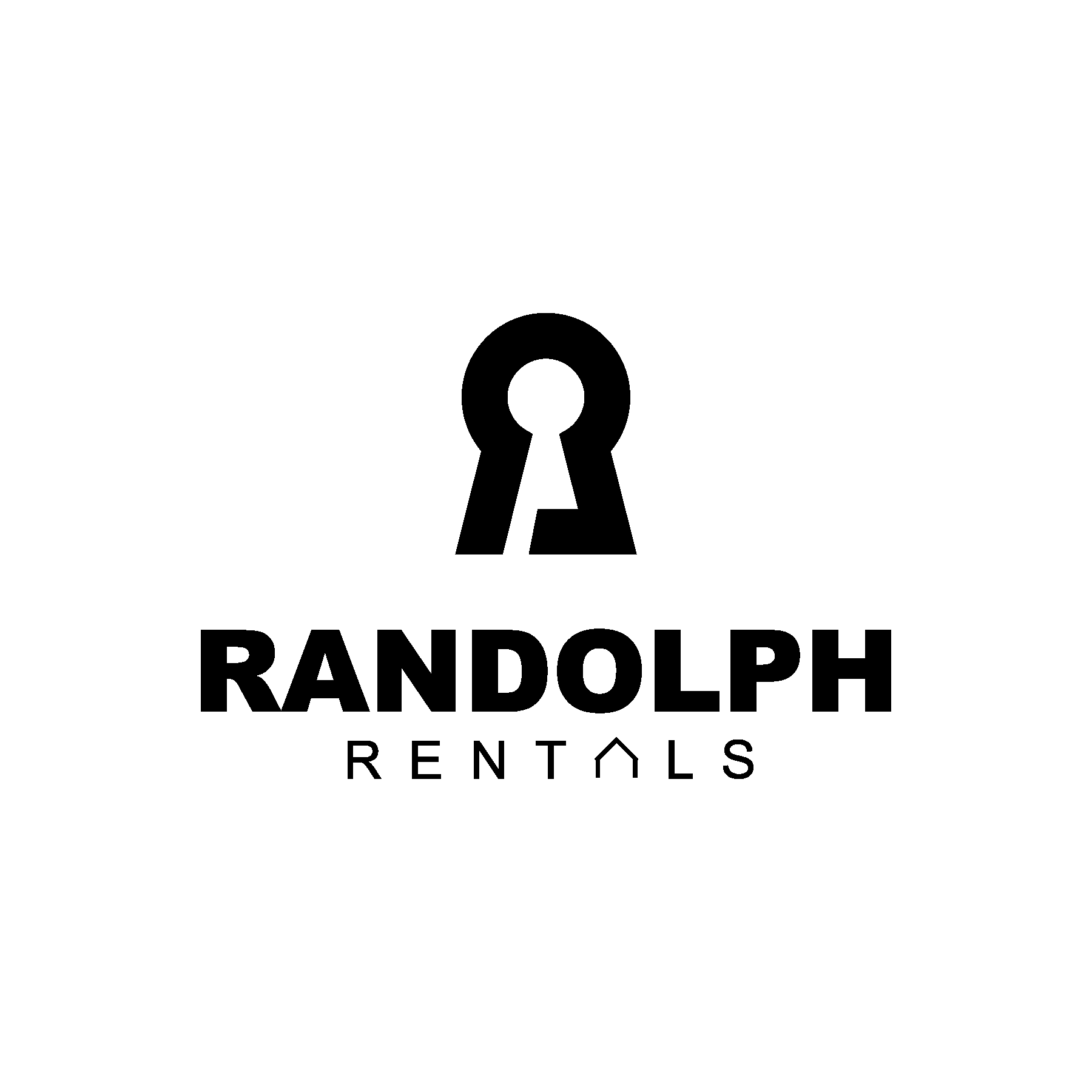
Randolph Rentals | Property Management
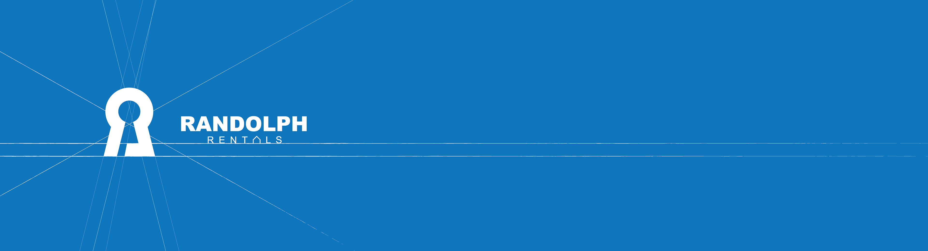
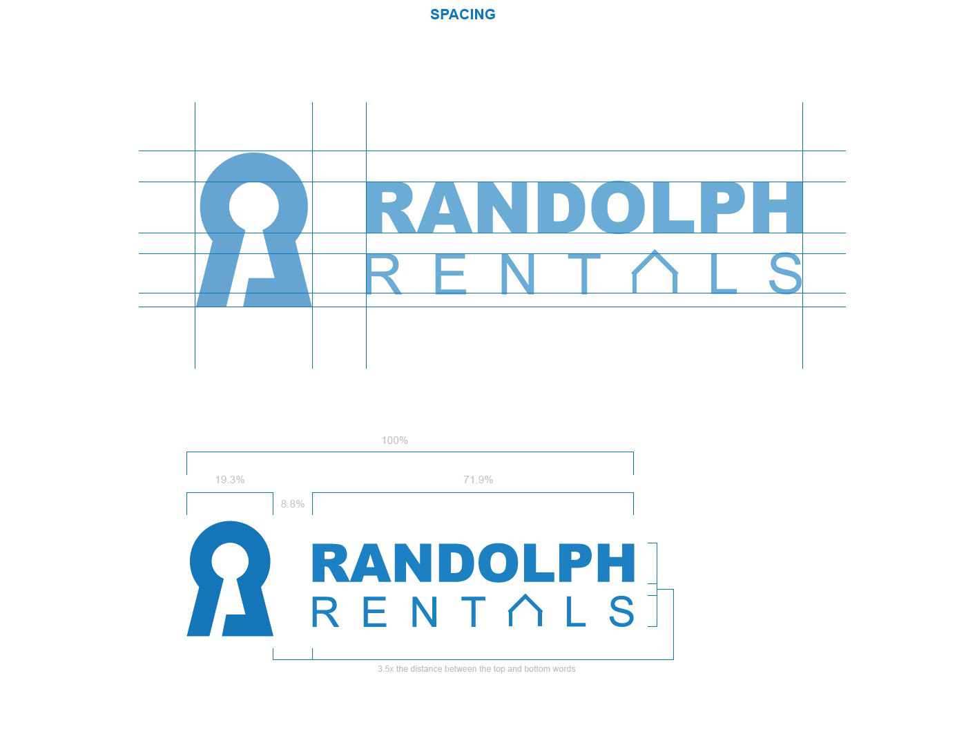
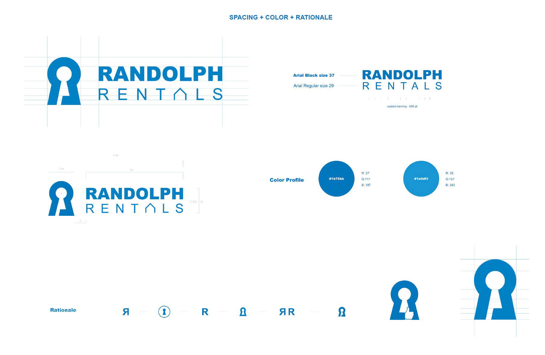
For Randolph Rentals, the goal was to create a brand that feels both approachable and dependable—just like the properties they manage. The keyhole icon - a symbol of security - also happens to be sublty shaped like an "R".
The logotype reinforces that balance of trust and modern simplicity. Altogether, the design delivers a clean, versatile identity that communicates accessibility, professionalism, and a promise of a place to call home.